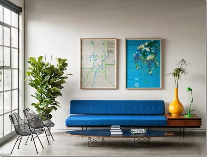
Today I’m taking a look at visual balance in interiors. I find though I am not formal, I do like some type of balance when I decorate. There’s something very unsettling about a lack of balance(at least for me).

Symmetrical balance is like a mirror image and is usually more formal in nature. Symmetrical balance is characterized by the same objects repeated in the same positions on either side of a vertical axis. As humans we tend to gravitate towards a symmetrical setting since it is reflective of the human form; two eyes, ears, etc. This symmetry also reflects the human form, so we are innately comfortable in a balanced setting.
Asymmetrical balance is less formal and has become popular in today's modern homes. Balance is achieved with some dissimilar objects that have equal visual weight or eye attraction. Though asymmetrical balance may be more difficult to achieve, it adds dynamic dimension to a space and keeps the design unpredictable. Whether you choose symmetrical or asymmetrical balance, I think most of us prefer and is most comfortable in a space that has visual balance which is what symmetrical and asymmetrical balance facilitate. Here are some more examples:
a good example of asymmetrical symmetry. visual balance is achieved with dissimilar items on either side of the sofa.


I think I incorporate more of the asymmetrical type of balance in my home; less formal. How do you feel about visual balance? Do tell. Blessings and have a wonderful day everyone! xx
images: pinterest, tumblr


0 comments:
Post a Comment