
Despite the lack of sunny weather, I decided that I would snap these pictures of the kitchen nonetheless. I was hoping for beautiful sunny skies, thus loads of natural light when I took these pics, but, alas, it’s been one very rainy and overcast summer so far. Anyway, let’s move on, shall we? Two years ago, we built our current home and the kitchen though notably smaller than the one we had at our prior home was appealing to me because it was open. In fact, I chose the blueprint for this house because of the very open floor plan, so, although the kitchen is tiny, it doesn’t feel like it. HOWEVER, I had to make some changes to the design that the builder had during the building process and when choosing materials etc. Let’s peek at the builder’s design below:


Though those pictures are not the most clear, you can see that the cabinets are raised and are more traditional in nature. Also, there is a fan in the middle and two pendant lights hanging over the bar in the first builder’s design image. It’s no secret that although I admire all styles, my personal aesthetic is modern in nature. As a result, I made some changes to “modernize” the design and feel of the kitchen.
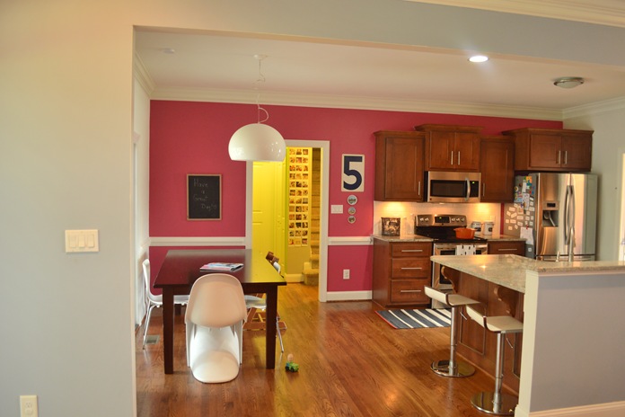
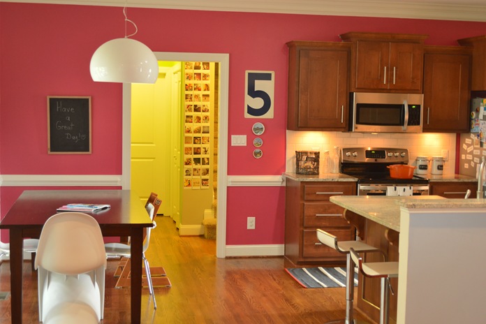
- I chose flat front cabinets(instead of raised) and modern pulls.
-
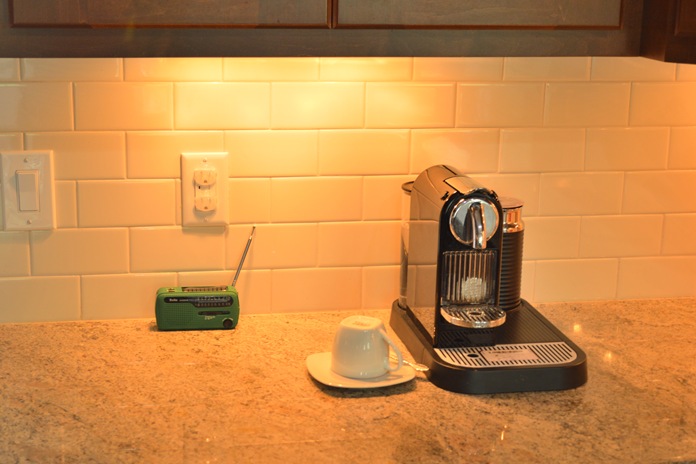
- For the backsplash, I kept it simple and went with white subway tiles.
-
- I opted for recessed lighting instead of pendant lighting over the bar area. I didn’t like the idea of having pendant lighting in the line of vision, especially in an open kitchen.
-
- The fan was definitely a no no, so an affordable Ikea light fixture has been temporarily placed(well, it’s been 2 years…) where a fan would’ve been. I’ve been admiring those simple E27 Muuto pendant lighting of late for that spot, but fear it might be too much visual activity…?
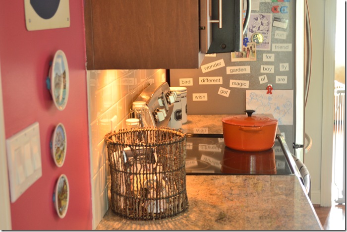
I thought of taking everything off the refrigerator to declutter, but felt that would be such a fake representation of how we live. Those are some of Zion’s words from a word kit that he has. There are also a few magnets from our travels on there. That blue stuff behind those decorative plates(we collected while living in Europe) is an adhesive made by Loctite. It doesn’t damage the walls and can be reused.

A very casual collage, but one that makes us smile…; a mixture of one of a kind vintage finds, a modern print, and some of our favourite pictures.
I always feel like we’re in a tree house because of all the trees that one can see from the kitchen. The sunroom and screened in porch are visible in this picture and also gives you an idea of ones vantage point from the kitchen.
This is another view taken from the living/great room.
Those polaroid pictures in the background (next to the stairs) were printed from my Instagram feed. I used a company called Origrami. They turned out beautifully and I especially love that they look like polaroids.
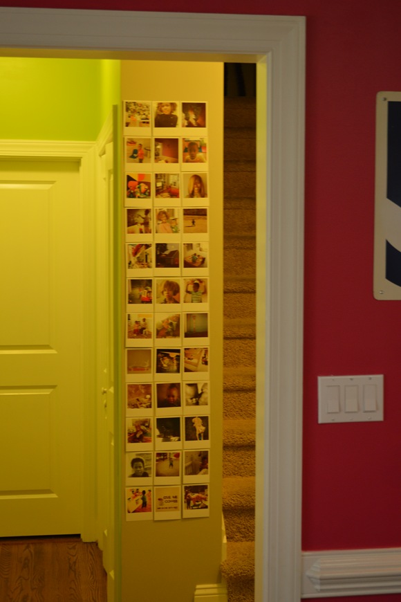
a not so clear close up
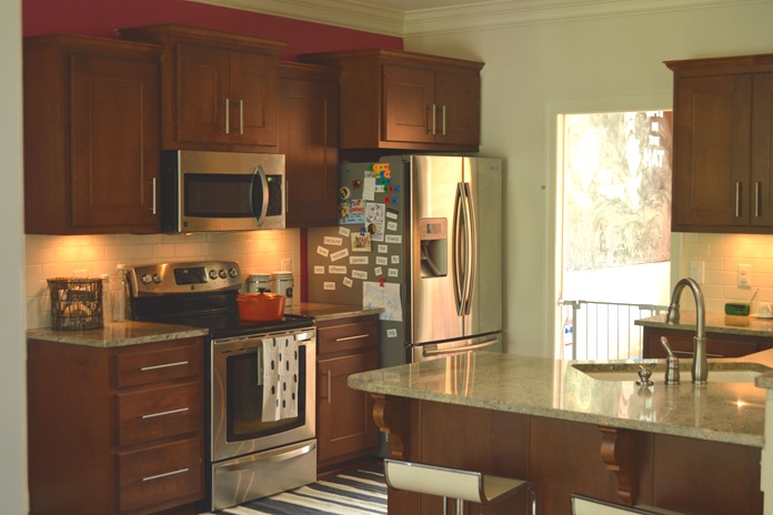
The formal dining room is to the right (facing the picture). However, since the day we moved in, it has been Zion’s playroom. Now, it’s Zion’s and Ian’s playroom . Design is undoubtedly dynamic just like our lives. The design of the spaces in our home (those spaces that are almost completed )are geared toward our lifestyle in the here and now. O.K., well that wraps up the reveal. There you have it, mi cocina! Blessings and Happy Wednesday. XX


0 comments:
Post a Comment